Wednesday, September 14, 2016

Monday, August 15, 2016

TABLEAU 9.0 Free Mock Test -(Available Now Visit -www.tableauinfo.com)

Free TABLEAU Mock Test -Available Now Visit -www.tableauinfo.com

Register Today !

Click Here -->http://www.tableauinfo.com/tableau-online-mock-tests.html

Author of MocK Test
Ritesh Bisht
TABLEAU Desktop Qualified Associate 2016
https://www.linkedin.com/in/ritesh-bisht-22238913?trk=hp-identity-photo


Monday, August 1, 2016

TABLEAU 9.0 Desktop Qualified Online Mock Test (Sample Papers )-Register Today


Tableau Online Mock test is something very rare .Hence we are coming up with this .


  1. Test prepared by TABLEAU Desktop Qualified professionals.
  2. Yes it is Free Version
  3. Time Duration - 1 hour
  4. Questions - 17
  5. Answer and Solutions will be provided on Demand basis.
  6. Hurry Limited Seats !


Please go through the Video Below.

https://www.youtube.com/watch?v=qr3aPqZyTwg&spfreload=5 (Steps to Register)

Steps to Register (www.tableauinfo.com   Find the same @ Home Page with other exciting info)


  1. Subscribe to https://www.youtube.com/channel/UCNxLAYEX1HICu97GhYzKqCw
  2. Email us below details @ Support@tableauinfo.com with your 
  • Name
  • Linkedin Profile Link
  • Experience on Tableau (Years/Months)
  • Preparing for TABLEAU Desktop Qualification Exam ? Yes/No
  • Demo -->https://www.onlineexambuilder.com/tableau-desktop-9.0-qualified-associate/exam-90067

Author of Mock Test
Ritesh Bisht
https://www.linkedin.com/in/ritesh-bisht-22238913
TABLEAU 9.0 Desktop Qualified Associate ,2016


Tuesday, July 26, 2016

Saturday, July 23, 2016

How to read a box plot/Introduction to box plots ?

How to read a box plot/Introduction to box plots


Simple explanation of box plot (imp for TABLEAU)
Box plots are drawn for groups of W@S scale scores. They enable us to study the distributional characteristics of a group of scores as well as the level of the scores.
To begin with, scores are sorted. Then four equal sized groups are made from the ordered scores. That is, 25% of all scores are placed in each group. The lines dividing the groups are called quartiles, and the groups are referred to as quartile groups. Usually we label these groups 1 to 4 starting at the bottom.

Definitions

Median
The median (middle quartile) marks the mid-point of the data and is shown by the line that divides the box into two parts. Half the scores are greater than or equal to this value and half are less.
Inter-quartile range
The middle “box” represents the middle 50% of scores for the group. The range of scores from lower to upper quartile is referred to as the inter-quartile range. The middle 50% of scores fall within the inter-quartile range.
Upper quartile
Seventy-five percent of the scores fall below the upper quartile.
Lower quartile
Twenty-five percent of scores fall below the lower quartile.
Whiskers
The upper and lower whiskers represent scores outside the middle 50%. Whiskers often (but not always) stretch over a wider range of scores than the middle quartile groups.


Interpreting box plots/Box plots in general

Box plots are used to show overall patterns of response for a group. They provide a useful way to visualise the range and other characteristics of responses for a large group.
The diagram below shows a variety of different box plot shapes and positions.

Some general observations about box plots

  • The box plot is comparatively short – see example (2). This suggests that overall students have a high level of agreement with each other. 
  • The box plot is comparatively tall – see examples (1) and (3). This suggests students hold quite different opinions about this aspect or sub-aspect. 
  • One box plot is much higher or lower than another – compare (3) and (4) – This could suggest a difference between groups. For example, the box plot for boys may be lower or higher than the equivalent plot for girls. Follow this up by looking at the Items at a Glance reports.
  • Obvious differences between box plots – see examples (1) and (2), (1) and (3), or (2) and (4). Any obvious difference between box plots for comparative groups is worthy of further investigation in the Items at a Glance reports. 
  • Your school box plot is much higher or lower than the national reference group box plot. This also suggests an area of difference that could be explored further in the Items in Detail reports and through consultation.
  • The 4 sections of the box plot are uneven in size – See example (1). This shows that many students have similar views at certain parts of the scale, but in other parts of the scale students are more variable in their views. The long upper whisker in the example means that students views are varied amongst the most positive quartile group, and very similar for the least positive quartile group. The Items in Detail reports can be used to explore this further.
  • Same median, different distribution – See examples (1), (2), and (3). The medians (which generally will be close to the average) are all at the same level. However the box plots in these examples show very different distributions of views.
    It always important to consider the pattern of the whole distribution of responses in a box plot. 

Sunday, July 10, 2016

Frequently Asked Questions for TABLEAU Certification


Watch my website for detailed preparation -->www.tableauinfo.com


NOTE: My new Tableau Certification channel section is released -->http://www.tableauinfo.com/tableau-videos.html

Hello Everyone ,
Got many questions , trying to answer all. If you have more email to bisht.ritesh@gmail.com

Watch official website blog having updated content -->  Tableau Info Blog on Tableau Desktop Qualification
1. How much did the entire ordeal cost? $250
Exam Format
Time Limit:
Passing Score: Content Version: Number of Questions: Question Format: Language(s) Offered: Delivery Platform:
Two hours (Please plan for extra time for online exam setup)
75%
9.0
16 knowledge-based (1 point each) and 18 hands-on (3 points each) Multiple choice, multiple response, true/false, matching
Many questions require hands-on work in Desktop to determine the correct answer. Access to the Desktop 9.0 application [con guration speci c to language of exam] will be provided during the exam.
2. How to get the necessary material(if any)? The pdf provided by TABLEAU is the best way to cover the topics.http://mkt.tableau.com/files/Desktop-9-QA-Prep-Guide.pdf
This is not only topics but link to various Videos & Knowledge Base coming from TABLEAU website itself .If you want to deep-dive , then there are Online trainings . I recommend from TABLEAU only (otherwise there are many) , they can provide you some material as well . Training is fully Hands On.But if you ask me , if we can try for certification without TABLEAU formal training , I would say "Yes" ,but you have cover everything from this pdf link to Videos & KB.
3. What is the process?
do we required to have practical experience(live working experience on Tableau) to take the certification exam
Definitely you need some experience ,9 months to 1 year should be good.
.
4 Which topics have more weight-age ?
Cover all the topics , but be very good with Calculations & Stats because it can be time consuming if you are not good at that. Yes both have v good weightage as well. But questions will come from all the corner.We definitely require working experience .Do not try without that. Experience of 1 year is good to have .
5. LOD and Table calculation how tough are question from these sections
Don't expect highly complex LOD questions but you should be clear with the LOD concept. That will help.
6. I have followed all the Tableau learning video tutorial from Tableau and have worked on creating same visualizations, will this be enough or I need to follow some other resources.
As fas as you cover everything from topics.http://mkt.tableau.com/files/Desktop-9-QA-Prep-Guide.pdf,itshould be good enough with Lot of Hands On Videos.If you think you are not strong in any particular topic . Go ahead and watch Youtube videos as well, there are many.
7. And also let me know what was your preparation strategy and how long did you prepare for certification.
a) Cover Everything http://mkt.tableau.com/files/Desktop-9-QA-Prep-Guide.pdf, each mark count and each $ count as well (250),
you never know if you miss by 1 mark.
b) Don't think that you know 80% and you can pass, remember that you need to score 76% which is a high score hence be safe and cover 100% topics.
c) RAREVVV IMP Take FREE TABLEAU Free Mock-test one created by Tableau Official Doc and the other created by Desktop Qualified Associates

http://www.tableauinfo.com/tableau-online-mock-tests.html
c) During the exam if you stuck in one quest , just leave it and bookmark it , leave it for the end.
d) Use good network , I would even suggest office network ,Exam is totally Online from your laptop/macbook.
e)1 mark question would be knowledge base & 3 marks questions will be hands on.
f)16 knowledge-based (1 point each) and 18 hands-on (3 points each) Multiple choice, multiple response, true/false, matching
g) So if you know all the topics , 1 point each questions will take no time and you get lot of time for remaining questions.
8. And if possible kindly share some sample questions from the test.
.
http://mkt.tableau.com/files/Desktop-9-QA-Prep-Guide.pdf
You can find sample questions & answers at the end , yes questions are pretty much like that.

9.5 important points http://www.tableauinfo.com/warning---know-it-b4-you-give-tableau-desktop-qualification-associate-exam-.html

10.I have created a separate Video Section for the Tableau Certification related videos, please check this page and subscribe to my youtube channel to stay ahead .

11.Yes ,Finally ,Free Online Mock Test here --> http://www.tableauinfo.com/tableau-mock-test-part-2.html

Ritesh
TABLEAU  Desktop Qualified Associate 
http://www.tableauinfo.com/who-am-i.html

Saturday, July 9, 2016

Filters Vs Parameters in Tableau: When to Use Them


When building a dashboard in Tableau, the analyst may want to filter many worksheets with a single filter selection. Tableau has three ways of making this possible:global quick filtersfilter actions, and parameters.
Global quick filters will filter each worksheet on a dashboard as long as they each contain that dimension. Filter actions use a "control" worksheet to filter other worksheets on the dashboard based on the selected elements in that sheet. Parameters allow the user to use what would otherwise be a quick filter as a filter if the dimension is different on each sheet.
In this post, we will explore the advantages and disadvantages of using each filter type and how to approach different use cases that call for dashboard filters.
Global Quick Filters
Advantages
Global quick filters are very useful when creating dashboards that contain worksheets that all use the same data source. For example, in a dashboard that displays the dataset in both text and visual forms, global quick filters give the flexibility to present the filter in a variety of formats: single value dropdown, multiple values list, wildcard match, etc. They also allow the user to show an aggregation of all marks with the "(All)" filter. 
Disadvantages
Of course, the main disadvantage of global quick filters is that if the analyst has a dashboard with worksheets that each use a different data source, they do not work. This is especially problematic when the component worksheets in a dashboard are displaying similar concepts but are built using datasets optimized for the specific type of worksheet the user needs (table, bar chart, map, etc.). In this case, even if the datasets all have the same columns and data types, the analyst is forced to find an alternative solution. 
Filter Actions
Advantages
Filter actions are best used when the user should interact with a specific sheet that acts as the "control." Examples of this may be a text table that lists product categories or a bar chart that lists sales numbers. In this case, the user may want to see other information about specific marks in these worksheets. By setting up filter actions, users can filter other worksheets in a dashboard by selecting the relevant marks.


Filter actions address the problem presented by global quick filters and the use of different datasets. Even if all the worksheets in a dashboard use different datasets, filter actions allow the analyst to assign connections between two fields in different datasets. Analysts can assign a single field connection, multiple fields, or all fields. This Tableau Knowledge Base article demonstrates how to set up the filter and the data relationships.


An example of this might be a text table of product sales in a given sales period. The user wants to see the various worksheets on the dashboard filtered by a specific product or products. In the product sales table, the user can CTRL-click the products they want to see and the other worksheets will be filtered accordingly. This can even work across dashboards.
Disadvantages
While filter actions allow the analyst to filter different datasets with a single click, it takes away the variety of ways the data can be filtered that global quick filters allow. The user must interact with the control worksheet to filter the other sheets connected to it. A simple quick filter (not a global one) that filters the control worksheet will not propagate to the other worksheets in the dashboard. For dashboards where a user might want to filter all worksheets by a given dimension, e.g., date or geographical region, a global quick filter or parameter would be better. 
Parameters
Advantages
Parameters address the problems of both global quick filters and filter actions: they allow the user to use a single dropdown or list that affects all connected worksheets in a dashboard and allow the analyst to connect the filter across datasets. Essentially, they act as an independent filter that can then filter the various worksheets. We won't cover how to set them up (they are linked to above) but by using parameters, analysts have greater power over how their worksheets are filtered. As long as the data types match, filters on each worksheet can be controlled by a parameter.
Disadvantages
Unfortunately, parameters have their own limitations. Whereas global quick filters have seven ways to be represented on a dashboard, parameters only have four. Parameters cannot make multiple selections in a filter, e.g., with a list of checkboxes, and they do not have the "(All)" aggregate choice of quick filters. While the inability to select multiple items in a filter cannot be circumvented, the data can be structured to include an "All" row that aggregates the relevant data for that mark. This is not optimal, since the analyst must make this consideration when preparing their data for use in Tableau, but it is the only workaround we have come across.
Conclusion

We have covered the three types of dashboard filters in Tableau and their strengths and weaknesses. As we continue to use Tableau in future projects, we hope to find solutions to some of the shortcomings of these filtering methods. If you have any questions or have a suggestion to work around the challenges we've written about, feel free to leave them in the comments below!

DYNAMIC Sheets Selection

Creating a Sheet Selector for a Dashboard
Product(s): Tableau Desktop
Version(s): All
Last Modified Date: 25 Jan 2016
When creating a dashboard view, sometimes you may want the ability to display only individual worksheets on the dashboard without having to create multiple dashboards or actions. In cases like this, you can create a “sheet selector” that gives you the ability to select an individual sheet from the dashboard and replace all sheets with just the sheet you selected.
For more information about how to organize your dashboards, see Organize Dashboards.


Step 1 
Right-click the Data window, and select Create Parameter.
Step 2 
Create a string parameter by doing the following tasks in the Create Parameter dialog box:
  1. In the Name text box, type a name for the sheet selector. For example, type Select a Sheet.
  2. In the Data type drop-down list, select String.
  3. Under List values, type All in the first text box, and then type the name of each sheet in the workbook in the subsequent text boxes. In the example below, the worksheet names are Line Chart, Map, and Bar Chart.
  4. Click OK when finished. 

Step 3 
Right-click the Data window, and select Create Calculated Field.
Step 4 
Give the calculation a name, and then in the Formula text box, type the name of the parameter you created in step 2.


Step 5 
For each sheet in your workbook, drag the calculation you created in step 4 to the Filters shelf and do the following tasks in the Filter dialog box:
  1. Select the Custom Value List option.
  2. Type All in the text box.
  3. Type the sheet name in the text box and click the Add Item button.
  4. Click OK when finished.


Note: After adding the filter to the sheet, your view may disappear. If this happens, show the parameter control and select the sheet name of the active sheet. To show the parameter control, right-click the view and select Parameter, and then select the name of the parameter you created in step 2.
Step 6 
Select Dashboard > New Dashboard.
Step 7 
From the Dashboard window, drag the Vertical layout container to the dashboard. Then, drag each sheet to the dashboard. 
Step 8 (Optional)
Right-click the title area of each sheet and select Hide Title.
Step 9 

Right-click the upper-right corner of a worksheet, select Parameter, and then select the parameter you created in step 2. This task displays the “sheet selector” that you can use to display individual worksheets on the dashboard.

Friday, July 8, 2016

Creating Variable Sized Bins

Worksheet -->  https://public.tableau.com/profile/ritesh.bisht#!/vizhome/Variable_Bin/Variable_Bin

One way to view a measure in Tableau Desktop is to split it into bins. You can think of bins as buckets based on a range of values. For example, say you have a measure that represents age. Instead of aggregating the measure to calculate the average age, you can bin the measure to define age groups: 0–5, 6–10, 11–15, and so on. Then you can count the number of people in each age group.
By default, Tableau creates even-sized bins based on a size you specify. In the example above, each bin represents five years. However, say you want to create bins of variable size, for example: under 21, 21–32, over 65, and so on. To do this, you can create a calculated field.
Create a calculated field for variable bin size
Step 1 
Select Analysis > Create Calculated Field.
Step 2 
In the Calculated Field dialog box, complete the following steps.
  1. For Name, type Age Groups.
  2. In the Formula box, build the following formula, which defines several age groups:IF
    [Age] < 21 THEN "Under 21"
    ELSEIF
    [Age] <= 32 THEN "21-32"
    ELSEIF
    [Age] <= 42 THEN "33-42"
    ELSEIF
    [Age] <= 52 THEN "43-52"
    ELSEIF
    [Age] <= 64 THEN "53-64"
    ELSE "65+"
    END

  3. Confirm that the status message indicates that the formula is valid, and then click OK.
Create a view with the variable bin field
Step 1 
From the Measures pane, drag Number of Records to the Rows shelf.
Step 2 
From the Dimensions pane, drag the new Age Groups field to the Columns shelf.
All of the records are split into the six bins that you defined in the calculated field.


Note: To sort the bins, right-click Age Groups in the Columns shelf, and click Sort.


Creating Variable Sized Bins

One way to view a measure in Tableau Desktop is to split it into bins. You can think of bins as buckets based on a range of values. For example, say you have a measure that represents age. Instead of aggregating the measure to calculate the average age, you can bin the measure to define age groups: 0–5, 6–10, 11–15, and so on. Then you can count the number of people in each age group.
By default, Tableau creates even-sized bins based on a size you specify. In the example above, each bin represents five years. However, say you want to create bins of variable size, for example: under 21, 21–32, over 65, and so on. To do this, you can create a calculated field.
Create a calculated field for variable bin size
Step 1 
Select Analysis > Create Calculated Field.
Step 2 
In the Calculated Field dialog box, complete the following steps.
  1. For Name, type Age Groups.
  2. In the Formula box, build the following formula, which defines several age groups:IF
    [Age] < 21 THEN "Under 21"
    ELSEIF
    [Age] <= 32 THEN "21-32"
    ELSEIF
    [Age] <= 42 THEN "33-42"
    ELSEIF
    [Age] <= 52 THEN "43-52"
    ELSEIF
    [Age] <= 64 THEN "53-64"
    ELSE "65+"
    END

  3. Confirm that the status message indicates that the formula is valid, and then click OK.
Create a view with the variable bin field
Step 1 
From the Measures pane, drag Number of Records to the Rows shelf.
Step 2 
From the Dimensions pane, drag the new Age Groups field to the Columns shelf.
All of the records are split into the six bins that you defined in the calculated field.


Note: To sort the bins, right-click Age Groups in the Columns shelf, and click Sort.


Context Filters

Simple 2.5 mins Video to explain Context Filter -> Context Filter with Top N Batsmen of the World
 https://www.youtube.com/watch?v=N0Rxs-84gSU

Live Hands-on Workbook https://public.tableau.com/profile/ritesh.bisht#!/vizhome/Context_Concept/wITH_Context


This example walks you through how to create a context filter. First you’ll filter a view to show the top 10 products by sales. Then you’ll create a context filter on product category so you can see the top 10 furniture products.


  1. Use the Sample - Superstore data source to create the initial view shown below. The view shows the sales for all sub-categories, sorted with the highest sale at the top.
  2. Now create a Top 10 filter to just show the top selling products. You can create this filter by dragging the Sub-Category field to the Filters shelf. In the Filter dialog box, switch to the Top tab and define a filter that is Top 10 by Sum of Sales. 
  3. When you click OK, you’ll see that the view is filtered to show the top 10 product sub-categories in terms of sales.
  4. Now, let’s add another filter to only show only furniture products. Drag the Category field to the Filters shelf and select only Furniture. When finished, click OK.
  5. The view is filtered but instead of 10 products, it now only shows 3. This is because by default all filters are evaluated separately and the view shows the intersection of the results. So this view shows that three of the top 10 overall products are furniture products.
  6. To find out what the top 10 furniture products are we need to make the Department filter a context filter. Right-click the field on the Filters shelf and select Add to Context.
  7. Now the priority of that filter(context) is boosted , please check the order of operation below.
  8. Hence , Department is filtered 1st with respect to other filters and there will be no intersection.

  9. The filter is marked as a context filter and the view updates to show the top four furniture products. Why not 10? Because only four of the sub-categories contain furniture. But we now know that the Top 10 filter is being evaluated on the results of that context.

Concept of Box Plot (Tableau)

Box -plot is one of the prominent feature important for TABLEAU Statistics section of Examination. Below is simple example to clarify the concept for the individuals new to it.


A small example should make things clear. Consider a small village with 25 inhabitants. This is what they earn and the resulting box plot:
Citizen Nr.
Income
Key Value
25
3,001.25
Maximum
24
2,996.45
23
2,919.35
22
2,787.02
21
2,784.72
20
2,696.83
19
2,412.51
Q3: 0.75 * 25 = 18.75 = 19.
18
2,400.43
17
2,367.84
16
2,333.37
15
2,285.53
14
2,214.87
13
2,069.79
Median: 0.5 * 25 = 12.5 = 13.
12
1,923.62
11
1,819.22
10
1,773.34
9
1,597.54
8
1,589.48
7
1,494.65
Q1: 0.25 * 25 = 6.25 = 7.
6
1,423.74
5
1,391.92
4
1,334.88
3
1,184.53
2
1,125.78
1
1,005.85
Minimum
As you can see, the basic idea is to sort the data and then select the minimum, the maximum and the values at the referring positions: median (0.5), lower (Q1) (0.25) and upper quartile (Q3) (0.75). Why these values are considered to be robust statistic key values? In order to explain this, consider a similar village with one rich person and the following incomes:
Citizen Nr.
Income
Key Value
24
10,345.67
Maximum
23
2,919.35
Upper Bound
22
2,787.02
21
2,784.72
20
2,696.83
19
2,412.51
18
2,400.43
Q3: (18. + 19.)/2 = 2,406.47
17
2,367.84
16
2,333.37
15
2,285.53
14
2,214.87
13
2,069.79
12
1,923.62
Median: (12. + 13.) / 2 = 1,996.71
11
1,819.22
10
1,773.34
9
1,597.54
8
1,589.48
7
1,494.65
6
1,423.74
Q1: (6. + 7.) / 2 = 1,459.2
5
1,391.92
4
1,334.88
3
1,184.53
2
1,125.78
1
1,005.85
Minimum / Lower Bound


Changing Views Using Parameters


These steps use the Superstore sample to create a new parameter while you build the calculated field that will take advantage of it.
Step 1
Select Analysis > Create Calculated Field.
Step 2
In the Calculated Field dialog box, for Name, type Column 1 Category.
Step 3
Next to Parameters, click Create, and in the Create Parameter dialog box, complete the following steps.
  1. Name the parameter appropriately so that viewers can tell what changing it will do. This example uses Select Column 1 Heading.
  2. For Data type, select String.
  3. For Allowable Values, select List, type None as the first value in the list, and then press Enter.
  4. Complete the list by typing the names of the additional dimension fields that you want to expose through the parameter.Note: This example uses the customer name, customer segment, region, department, and category fields. These are all dimensions of the same data type (string). If you wanted to include a measure such as profit in this list, one option would be to convert the measure to a string value. You would do this when you build the calculated field, using the STR() function. This article covers only the single data type scenario.
  5. The Display As aliases default to the field name, and for this exercise you can leave them as they are.
  6. Click OK to return to the Calculated Field dialog box.
Step 4
Repeat the previous step to create the following additional parameters:
  • Select Column 2 Heading
  • Select Row 1 Heading
  • Select Row 2 Heading
Tip: Instead of typing each value in the list, click Add from Parameter to add them from Select Column 1 Heading.
Step 5
In the Calculated Field dialog box, for Formula, build the following calculation:
WHEN 'Customer Name' THEN Customer Name
WHEN 'Customer Segment' THEN Customer Segment
WHEN 'Region' THEN Region
WHEN 'Department' THEN Department
WHEN 'Category' THEN Category
ELSE ''
END
Confirm that the status message indicates that the formula is valid, and then click OK.
Note: ELSE accounts for the None value that you included in the parameter, and it returns an empty string.
Step 6
Create three more calculated fields, one for each of the additional parameters you created:
Parameter name
Calculated field name
Select Column 2 Heading
Column 2 Category
Select Row 1 Heading
Row 1 Category
Select Row 2 Heading
Row 2 Category
The basic formula for each calculated field is the same as in the previous step, except that you reference a different parameter in each CASE statement.
Give viewers a way to interact with views
Now you expose the parameter control so users can select the categories they want to display.
Step 1
For each parameter you created, do the following:
In the Parameters pane, right-click the parameter and select Show Parameter Control.
Step 2
From the Dimensions pane, drag the calculated fields you created to the Columns and Rows shelves.
Step 3
From the Measures pane, drag a measure to the view. In this example, Sales is placed on Label on the Marks card.
Step 4
Test your parameters by selecting fields in the parameter controls.
Tips:
  • Sort the dynamic dimension fields alphabetically.
  • Hide field labels for rows and columns.
Step 5
Reset all parameters to None and publish the workbook to Tableau Server.

Viewers can set up their own reports, save their parameter settings, and share views with others.

Filters Priority in TABLEAU


Tableau Conference 2015 this month in Las Vegas, Jen Vasser, a sales consultant at Tableau presented her version of the order of operations or the Query Pipeline. She included:

  • Data Blending 
  • Forecast
  • Annotations, Reference Lines, Trend Lines, Tooltips, Pages, Titles

Last month (September 2015), I updated the diagram to include Set Filters and called it the Precedence of Filtering. Note that I make the pipeline get narrower when going down, because all but the last filters are reducing the data set at the record level. The data set is getting smaller and smaller.

The context filters are actually regular filters that we have manually assigned higher priority in execution. On the other hand, all filters provide context for the filters that follow.


Wednesday, July 6, 2016

Changing / Swapping Data-source for Duplicated Worksheet


    How to set up  worksheets which I can re-use with different filtered data /data source ?

  1. Copy the Tableau file (or save as different name). Now you have FileA and FileB.
  2. Open up FileB and replace data source with your new datasource. 
  3. When that is done, open up FileA and Copy/Paste the workbooks/dashboards you want from FileB to FileA. 
  4. These should now have the new datasource and FileA still has the original datasource. Keep going for as many datasources as you have.

Saturday, June 25, 2016

Advance PARAMETER in Tableau

The following example shows how to create a single text box on a dashboard that filters a list of customers by Region or Product Sub Category. To create this type of filter, you will need to create a parameter, a calculated field, and a filter.


Note: Use this strategy when you want to filter on a single value at a time. For example, looking at only the East or only Tables products.
Create the parameter
The first thing you will need to create is a parameter. The parameter is where users will type in the Region or Product Category values.
Step 1 
Connect to your data source. This example uses the Sample - Superstore data source.
Step 2 
Right-click an empty area in the Data window and select Create Parameter.
Step 3 
In the Create Parameter dialog box, give the parameter a name such as Filter On. Then specify the parameter settings.


Step 4
Create a calculated field
Now that you have a parameter to collect the value you want to filter on, you need some way of specifying the filter. You can do that by writing a calculated field that compares the Region and Department values to the Filter On value.
Sub Step 1 
Select Analysis > Create Calculated Field.
Sub Step 2 
In the Calculated Field dialog box, do the following tasks:
  1. In the Name text box, type Show in View.
  2. In Formula text box, type the formula below, and then click OK.
if [Region]=[Filter On] and [Product Sub-Category]!=[Filter On] then 'Select'
ELSEIF [Region]!=[Filter On] and [Product Sub-Category]=[Filter On] then 'Select'
else 'Ignore' END

Step 5
Filter the view
The final step is filtering the view to only include the rows that were marked as "Select." (Note you have to first enter select then click on '+' button)


Step 6
When finished, click OK.Build the view
Now that you have all the pieces, build the view you want. Make sure you show the parameter control by right-clicking the parameter in the Data window and selecting Show Parameter Control.


Addressing and Partitioning


Table calculations are performed on a single measure in the view. The dimensions that define the part of the table you are applying the calculation to (computing along) are called addressing fields, and the dimensions that define how to group the calculation are called partitioning fields. In the example of a running sum of product sales across several years, the addressing field is the Date field, and the partitioning field is the product field. When you define the addressing for a table calculation, all the other dimensions are used for partitioning.
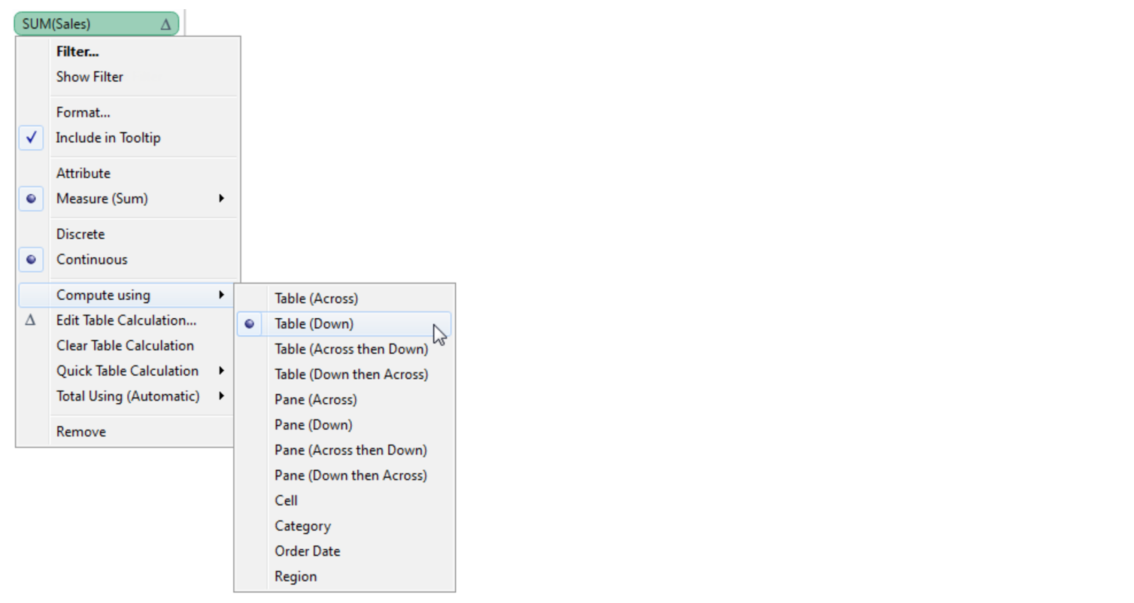
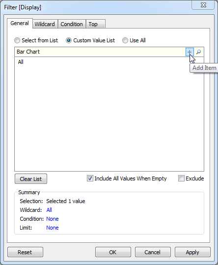
You specify addressing when you create or edit a table calculation, in the Table Calculation dialog box. To update addressing for a field in the view that already has a table calculation, right-click the field and choosing one of the options under Compute using. For example:


Addressing can be relative to the table structure (options beginning with Table, Pane, or Cell) or to a specific field (such as Category, Order Date, or Region). Addressing options based on table structure are described below.
Table (Across)
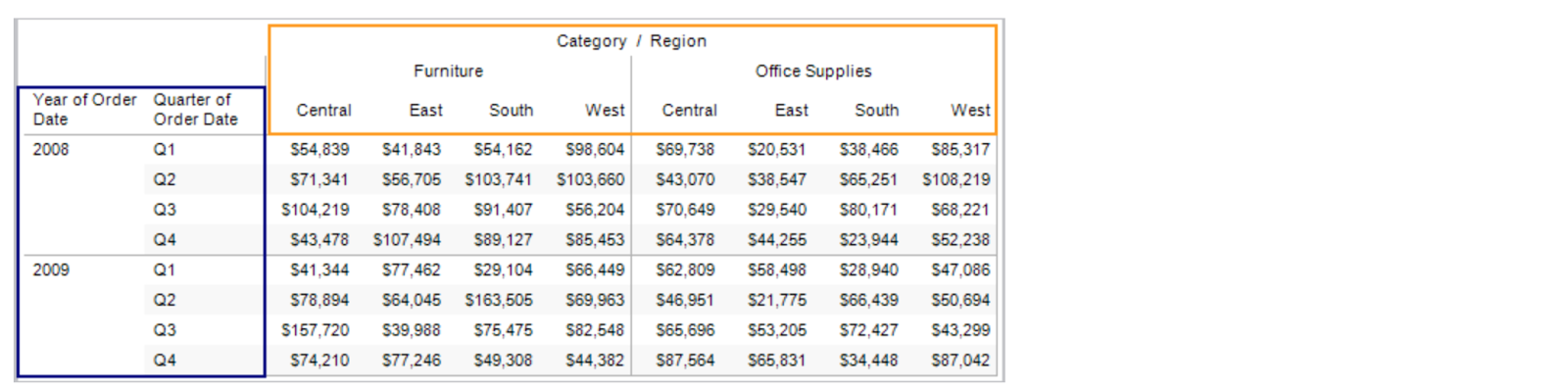
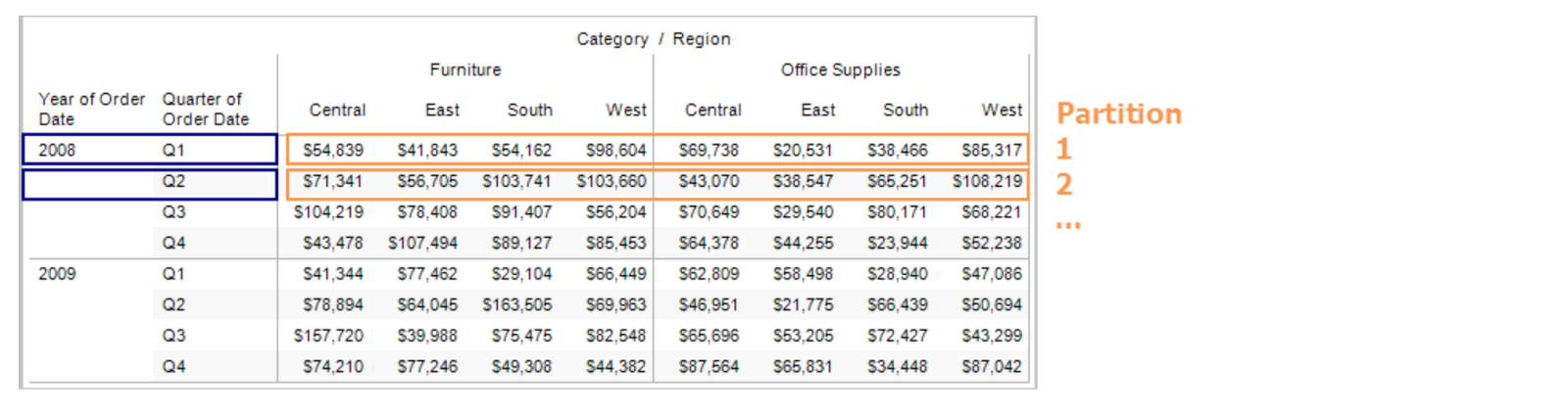
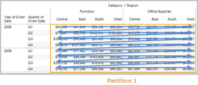
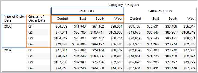
This option sets the addressing to compute along the entire table moving horizontally through each partition. For example, the view below shows quarterly sales by region and product category. When a calculation addressing is set to Table (Across), the dimensions that span horizontally across the table are the addressing fields (in the view below, Category and Region). All the other dimensions (Year, Quarter) are partitioning. The addressing dimensions are shown in orange, while partitioning dimensions are shown in blue.


That means that each partition will be the combination of Year and Quarter. Any calculation that is performed is scoped to the partition. For example, if the calculation is percent of total, the calculation will be performed on the numbers within each of the orange boxes.


Table (Down)
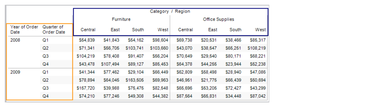
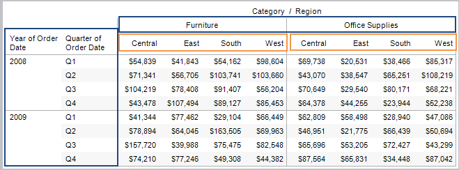
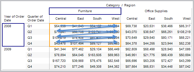
This option sets the addressing to compute along the entire table moving vertically through each partition. For example, the view from above is shown below with the addressing set to compute along Table (Down). The fields that span vertically (Year, Quarter) are now the addressing fields and the rest of the fields are partitioning (Category, Region). The addressing fields are shown in orange while partitioning fields are shown in blue.


That means that each partition is the combination of Category and Region.


Table (Across then Down)
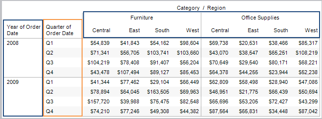
This option sets the addressing to compute across the entire table horizontally and then down the table vertically. This means that both the fields that span across the table and down the table are addressing fields.


That means that the entire table is the partition. The computation will compute across, move to the next row and continue to compute across, and so on.
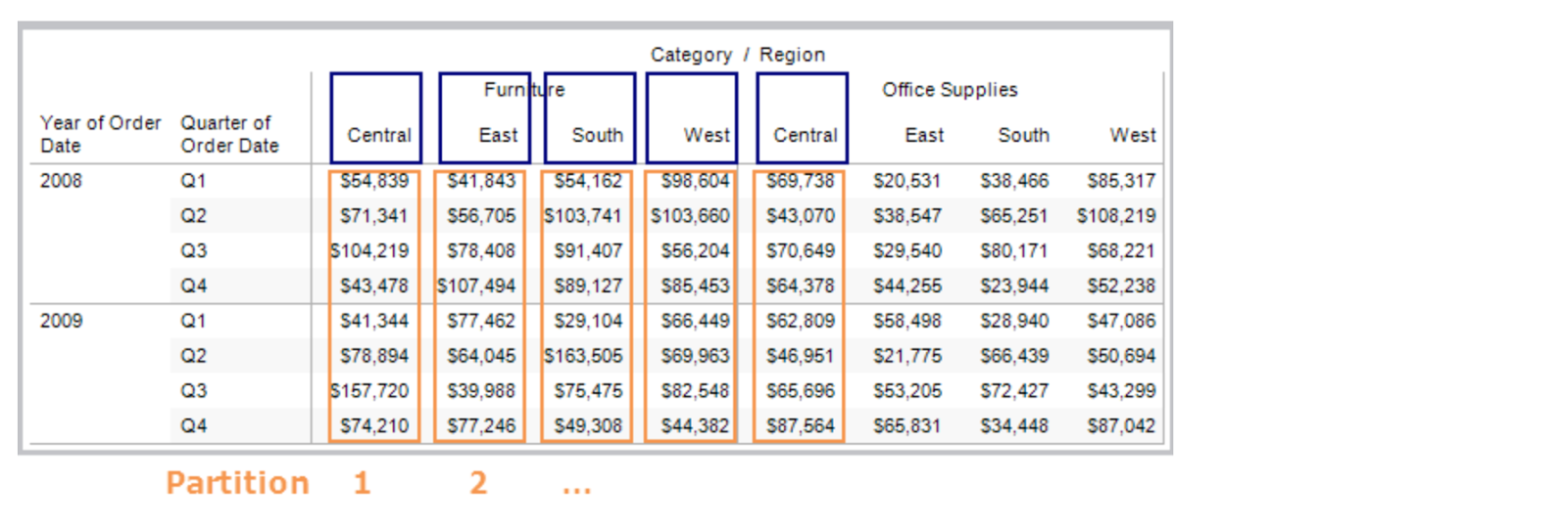
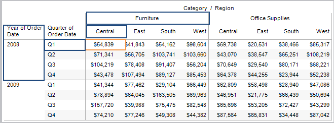


Pane (Across)
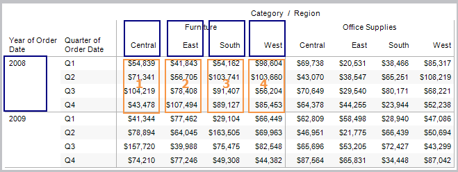
This option sets to compute across the pane horizontally. The fields that span across the pane horizontally are the addressing fields. However, the fields that separate the panes are now partitioning fields. In the example below Category becomes a partitioning field along with Year and Quarter. Region is the addressing field.


That means that the combination of Year, Quarter, and Category is the partition.


Pane (Down)
This option sets the addressing to compute down the table within the pane. The fields that separate the pane (Category, Year) are partitioning fields. In addition, Region becomes a partitioning field and Quarter is the addressing field.


That means that the combination of Year, Category, and Region is the partition.


Pane (Across then Down)
This option sets the addressing to compute across within the pane, then move to the next row and continue to compute across. The addressing fields are both the fields that run across the table horizontally and down the table vertically (Region, Quarter). The partitioning fields are the fields that define the pane (Category, Year).


That means that the combination of Category and Year make up the partition.
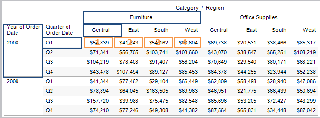


Cell
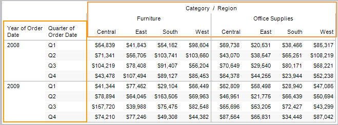
This option sets the addressing to the individual cells in the table. All fields become partitioning fields. This option is generally most useful when computing a percent of total calculation.


That means that the partition is the combination of Category, Region, Year, and Quarter.


Individual Fields
The individual dimensions in the view are listed below the option above in the Table Calculation dialog box. Use them to set the addressing to compute using the field you specify. The benefit of this option is that you get absolute control over how the calculation will be computed—if you change the orientation of your view, the table calculation will continue using the same fields for addressing and partitioning. Be careful though, because, addressing on an individual field means that when you rearrange the table, the calculation may no longer match the table structure.
Advanced
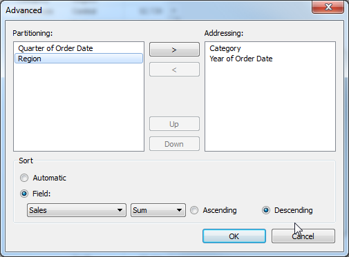
The advanced option lets you specify multiple fields to act as the addressing fields. When you select Advanced, a dialog box opens where you can specify one or more fields to act as addressing fields. Then you can specify how to order those fields.


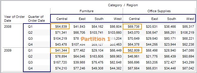
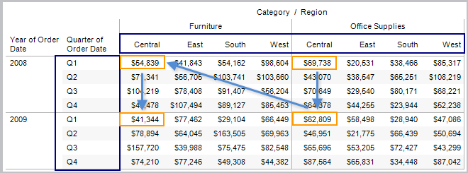
For example, in the view below the addressing fields are set to Category and Year. These are ordered by SUM(Sales), in descending order (from greatest to least). That means that the combination of Quarter and Region create the partition. Q1 Central exists four times in the table, and that is the partition.


Because the order is set to SUM(Sales), the calculation is computed based on their SUM(Sales) values from highest to lowest.
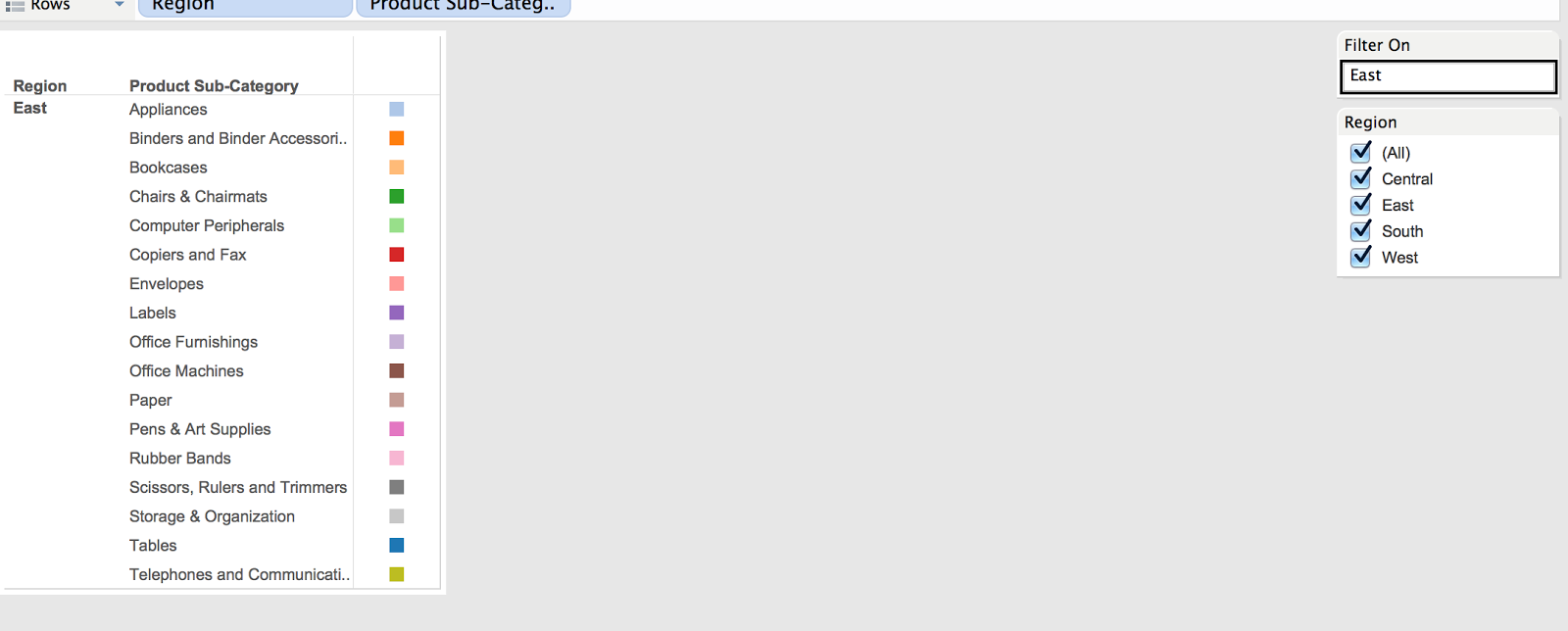
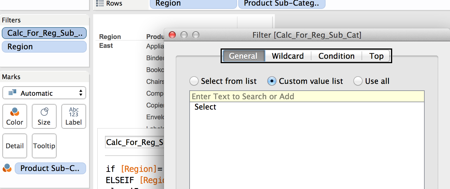